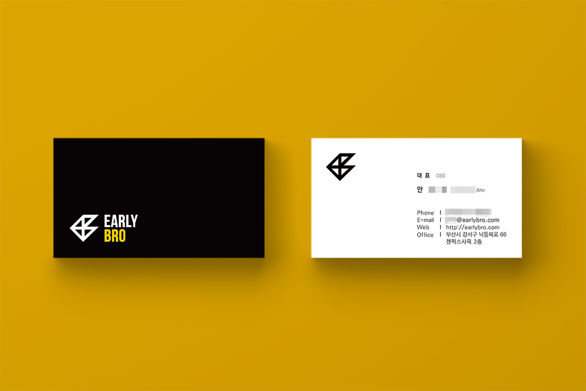
Marong Marong Studio designed the brand logo and business cards for Early Bro Inc. The triangular shape in the logo symbolizes breaking boundaries and dynamic interaction. The three vertices represent the company, business clients, and consumers. The four triangles combined form a symbol that subtly incorporates the letters ‘E’ and ‘B’. The overall design evokes a sense of forward movement, similar to a bird or an airplane, reflecting the company’s value of “fast execution.”
![]()
![]()